Leveraging Data Visualization to Monitor User Access to Sensitive Data

In the digital age, where massive amounts of data are generated and stored, ensuring the security of sensitive information is paramount. As organizations handle increasing volumes of confidential data, monitoring and controlling user access become crucial components of data security strategies. Data visualization emerges as a powerful tool in this realm, offering insights and transparency that traditional methods often lack. I am trying to explore the significance of data visualization in tracking user access to sensitive data, the reasons behind its adoption, and practical ways to implement it.
In today’s digital landscape, safeguarding sensitive data is paramount. But with complex systems and countless user interactions, tracking access can feel like navigating a digital maze. This is where data visualization steps in, transforming abstract data into actionable insights, illuminating potential security risks with unprecedented clarity.
Data Visualization
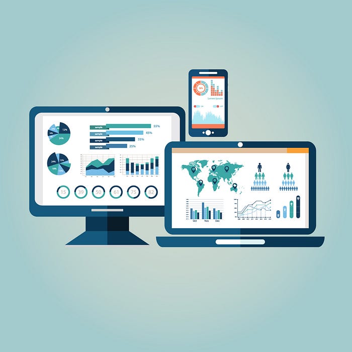
Think of data visualization as a translator, turning numbers and statistics into a visual language we can readily understand. Charts, graphs, and maps become the storytellers, revealing patterns, trends, and anomalies that might otherwise remain hidden within spreadsheets and tables. Data visualization is the graphical representation of data to uncover patterns, trends, and insights that might be challenging to discover from raw data alone. Through charts, graphs, maps, and dashboards, data visualization transforms complex information into a visual format, making it easier to understand and analyze.
Why Data Visualization for Data Security?
Data security involves protecting sensitive information from unauthorized access, disclosure, alteration, or destruction. By incorporating data visualization into security strategies, organizations can enhance their ability to monitor and respond to potential threats.
Identify Unusual Access Patterns: Visualization provides a clear and concise overview of user access patterns, allowing security teams to quickly identify anomalies or suspicious activities. Spot spikes in data access, unusual login times, or unauthorized attempts through clear trends and deviations from the norm.
Real-time Monitoring: Visualizations enable real-time tracking of user access, providing instant alerts when unauthorized access attempts occur.
Improved Decision-Making: Visual representations make it easier for security professionals to make informed decisions based on the analysis of user access patterns and trends. Track user behavior against data security policies, visualizing instances of potential non-compliance or unauthorized data sharing.
How to Use Data Visualization for Data Security?
Here are some steps to utilize data visualization in monitoring user access to sensitive data:
Define Key Metrics: Identify the critical metrics related to user access, such as login frequency, access times, and data retrieval patterns. Select chart types that best illuminate trends and anomalies, such as line charts for access frequency over time, heatmaps for identifying high-activity areas, or network graphs for revealing unauthorized access paths.
Gather the Right Data: Start by collecting relevant data points like access logs, user profiles, data classifications, and timestamps to provide context for user interactions.
Implement User Authentication and Authorization Controls: Utilize visualization to monitor user authentication processes and ensure that only authorized personnel have access to sensitive data. Prioritize user privacy and data security. Aggregate and anonymize data, avoid revealing individual details, and implement access controls for sensitive visualizations.
Actionable Insights: Translate visual insights into concrete actions. Investigate anomalies, refine security protocols, and educate users based on the data-driven evidence.
Data Visualization Tools for Data Security
Several data visualization tools are well-suited for tracking user access to sensitive data. These tools offer a range of features, including real-time monitoring, customizable dashboards, and advanced analytics. Some popular options include:
Splunk: Splunk is a versatile platform that enables organizations to analyze and visualize machine-generated data, including security logs.
Logz.io: Offers interactive charts and alerts for analyzing security logs and identifying threats.
Tenable.io: Features security vulnerability maps and dashboards for comprehensive risk assessment.
Microsoft Azure Sentinel: Delivers a unified platform for visualizing security data across cloud and on-premises environments.
Tableau: Tableau offers robust data visualization capabilities, allowing organizations to create interactive and shareable dashboards to monitor user access patterns.
Power BI: Microsoft Power BI is a business analytics tool that provides interactive visualizations and business intelligence capabilities, making it suitable for monitoring data security.
QlikView/Qlik Sense: Qlik’s products allow organizations to create dynamic and interactive visualizations for in-depth analysis of user access data.
In an era where data security is of utmost importance, leveraging data visualization tools is a strategic move for organizations seeking to monitor and enhance user access controls. By transforming complex data into visual representations, security teams can quickly detect anomalies, respond to threats, and make informed decisions to safeguard sensitive information. With the right combination of data visualization tools and thoughtful implementation strategies, organizations can strengthen their defenses and stay ahead in the ever-evolving landscape of data security.
